

Balancing trust and growth in cycle insurance subscription design, +20% Opt-Ins
ROLE
Head of Experience Design
CONVERSION
20%
TEAM NUMBER
5
TIMELINE
2 months
Bikmo is a rapidly scaling insurtech company founded in 2014 in Chester, UK, whose mission is to protect the world’s riders and the places they ride. With approximately 55 team members and more than 75,000 customers across the UK, Ireland, Germany, and Austria, the firm has attracted multiple rounds of private-equity funding to fuel its European expansion
Design Challenge
A recent UK ruling has stipulated that insurance providers must now give customers the ability to opt out of auto-renewal at the point of purchase, or during their policy term.
Currently, 15% of our customers opt out of auto-renewal, impacting revenue and leaving customers without cover after policy expiration. The existing solution, hidden at the bottom of the page with pre-ticked auto-renewal, may lead customers to feel misled.
My Design Process
01
Heuristic
Evaluation
Started with detecting UI/UX issues using Heuristic Evaluation design principles.
02
Prototype
Design
Create design recommendations based on the heuristic problems.
03
Collaborate with
Engineering
Work closely with engineering team to specify design requirements.
04
Measure
Impact
Measure design impact using data on Tableau and share the insights to the team.
01
Heuristic Evaluation
Design principles evaluation revealed a visibility issue that may make users feel manipulated
The initial state of the "Renewal opt-in" design showed issues from Heuristic Evaluation principles called “Visibility of system status.”

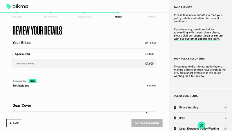
1.1 Before - Initial state
The auto-renewal option was hidden at the bottom of the page and grouped with unrelated stuff. It was also pre-selected as auto-renewed, which could make users feel deceived or manipulated (a dark pattern).

1.2 Heursitic evaluation
Heuristic evaluation – Visibility of system status: Clearly communicating the current state of the system helps users feel in control, take appropriate actions to reach their goals, and ultimately trust the brand.
This is a major usability issue because it introduces a dark pattern, creating the perception that users are being manipulated into auto-renewal. In addition, the lack of clear information about the implications of opting out increases cognitive load and makes it harder for users to make informed decisions
02
Prototype Design
Design recommendation improves user control that aligns with ethical design principles

2.1 After - proposed solution
The solution highlights the pre-ticked opt-out option, which is now aligned with the initial brief of the UK ruling policy.
It also improves user control by making the opt-out option as a stand-alone section, clear, visible, and deliberate, while educating users about the benefits and consequences of their choice.
This aligns with ethical design principles such as:
- Clarity – users can easily understand what’s being offered.
-
User control and freedom – users can make informed, intentional decisions.
-
Trust and transparency – builds confidence by being upfront rather than sneaky.
03
Collaborate with Engineering
Collaboration with engineering introduced the tooltip as a new design system element
3.1 Auto renewal opt-out at the point of purchase
I worked closely with the Engineering team to discuss the specification of the design solutions, attend their sprint reviews, and make sure that the end product aligns with the design solutions proposed.

3.2 Bikmo Design System - new component added
04
Measure the impact
The solution delivered a significant spike from 79% to 99% of opt-in after two months
From the quick and small tweaks, the solution increased the opt-in of auto-renewal insurance at the point of purchase by 20%. The impact shows a significant spike in the course of 2 months.
This has the potential to increase our retention rate over the year to anywhere up to ~5%.
A 5% improvement in retention rate from 80% to 85% increases the lifetime of customers from 5 years to 6.7 years, or a 34% improvement.

The redesign demonstrated that transparency and growth are not opposing forces. By addressing visibility issues and removing dark patterns in the auto-renewal flow, users were empowered to make informed decisions without compromising business objectives.
Through clear communication and close collaboration with engineering, the solution was implemented seamlessly, leading to a 20% increase in auto-renewal opt-ins within two months and a projected 5% lift in customer retention. This project shows how ethical, user-centered design can deliver measurable business impact while strengthening long-term trust.